
Hi Guys,
This is an unusual post, I think. But I really need help. As you all know I don’t have a logo for my blog and I want to have one. So I let my cousin do it for me. She did two logos which I both like. Well, I can’t have two logos, can I? 🙂 🙂
Here they are:
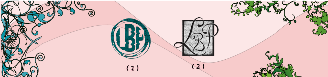
So what do you think? 1 or 2.
That’s all guys. Thank you in advance.

#1 – seems edgier!
LikeLiked by 1 person
Thank you Rylee… I think so too. 🙂
LikeLiked by 1 person
I think the first one is perfect 💕Lily
LikeLiked by 2 people
Thank you Pri…
And by the way, how are you these days? 🙂 🙂
LikeLike
Just busy in my last year of High school 🤗🤗😄
LikeLiked by 1 person
Awww, goodluck. 😊😊
LikeLike
I like the first one too!
LikeLiked by 1 person
Thanks for voting. Really appreciate it. 🙂 🙂
LikeLiked by 1 person
Honestly I liked them both, but have always been a fan of classic letters. So my choice goes out to number two, but I seem to be in the minority for this 😅😂
LikeLiked by 1 person
Me too, I liked them both and number 2 is because of the same reason as yours. But yep so far you’re in minority…:) 🙂 Thanks for voting,
LikeLiked by 1 person
I like them both, but prefer number 2. I think it depends on what style/feel you want for your blog, though. 1 is edgier, as Rylee said, whereas 2 is more classic and feminine I reckon.
LikeLiked by 1 person
Thank you so much for your opinions. 🙂 🙂 Actually, both will suit my blog, I think. Hehe.. That’s why it’s a little hard for me to choose.
Thanks again.
LikeLiked by 1 person
I like 1 the best.
LikeLiked by 1 person
Thank you so much for voting… I really appreciate it. and so far number 1 has more votes. 🙂
LikeLike
I like 2. It seems more warm.
LikeLiked by 2 people
Thanks for voting. 💜 And classic-ish, isn’t it? 🙂
LikeLiked by 1 person
Classic-ish is a good description.
LikeLiked by 1 person
🙂 🙂
LikeLike
I prefer #2 🙂 the letters are more clear and I like the ‘page’ background
LikeLiked by 1 person
Oh yeah, I told my cousin that the letter P in the first 1 looked like F… hehe.. Thanks for the input and now that you mentioned the page background, it seems like it suits my site more as Lili’s Blissful Pages. :
LikeLiked by 1 person
This is so hard! I honestly think I like them both equally, but I prefer the lettering in #2? 🙈
LikeLiked by 1 person
Right? I like them both too but yeah the lettering in #2 is so aesthetic. 🙂
Thanks for voting Lily.💜
LikeLiked by 1 person
My pleasure! ☺️ I hope it helped your decision making process, if only marginally. 🙈
LikeLiked by 1 person
hehe.. It definitely helped.. thanks again. 💜
LikeLike
I like 2… I prefer flowing letters more
LikeLiked by 1 person
I love flowing letters too and that font. 🙂 Thanks for voting Shalini. 💜
LikeLiked by 1 person
I like them both but I prefer #2
LikeLiked by 1 person
Yay. so far #2 is winning. Thanks for voting Misty. 💜
LikeLiked by 1 person
Of course!! 💕
LikeLiked by 1 person
💜💜
LikeLiked by 1 person
I like #2. 🙂
LikeLiked by 1 person
Thanks for voting Kathy… 💜💜
LikeLiked by 1 person
#2 I love!
LikeLiked by 1 person
Thanks Tiana. 💜💜 Currently #2 is winning. 🙂
LikeLiked by 1 person
#2 🙂
LikeLiked by 1 person
Thanks Lola…so far #2 is winning. 💜
LikeLiked by 1 person
I like number two!! It’s classic but special. It stands out to me!
LikeLiked by 2 people
I think #2 is gonna win.. no problem with me coz I love them both. But you’re right, it looks so classic and special.. that font is beautiful.
Thanks for voting Kristin. 💜💜
LikeLiked by 1 person
I vote for the first one.😄
LikeLiked by 1 person
Hi Angela…Thanks for voting. 💜💜 I feel bad, I’ve been in and out of blogosphere, I actually just post and reply on comments I haven’t read your posts in a while… I’m just so busy these days…Expect some spam likes and comments from me soon.. hehe…
LikeLiked by 1 person
You’re always welcome 😄 and don’t feel bad! Just take your time and thank you for the spam likes and comments. heheheh
LikeLiked by 1 person
Hehehe… I’m glad you understand. 💜💜
LikeLike
I like #2!! 🙂 I love how clear it is from the logo that you’re a book blogger!
LikeLiked by 1 person
I couldn’t agree more… Thanks for voting..I really appreciate it. 💜💜
LikeLiked by 1 person
Ooh I really like the first one!!
LikeLiked by 1 person
Thank you so much for voting. ❤️❤️❤️
LikeLiked by 1 person
#2 as I think it fits your blog better 😉
LikeLiked by 1 person
Thank you. ❤️ I think #2 is gonna win..
LikeLike
I like them both, but I think I like #1 better!
LikeLiked by 1 person
Thanks for voting Whitney. 🙂 🙂 ❤️❤️
LikeLiked by 1 person
I go for the #1 :3
LikeLiked by 1 person
Yay, thank you so much for voting. 🙂 🙂 🙂
LikeLiked by 1 person
They’re both great but i think the second is better. More professional yaknow?
LikeLiked by 1 person
😊 Thank you for voting, I think so too. ❤️
LikeLiked by 1 person
I love number two!
LikeLiked by 1 person
Thank you for voting, 🙂 🙂
LikeLiked by 1 person
I also like them both, but if I had to choose, I would pick 2.
LikeLike